
Photo by Tom McCorkle
Brand Identity and Art Direction | Voraciously from The Washington Post
As the Art Director of the Food section I was responsible for pitching, creating, and delivering the visual identity of a new sub-brand. The brief was to create visually driven content geared toward a previously unreached national audience, millennials with little experience cooking. I collaborated with several teams across the newsroom to ensure that the brand identity and art direction was fused with every piece of branded content including editorial, photo, video, social, product design, engineering, and marketing. Visual risk taking was key to defining this brand and creating a space for it to have lasting impact on new readership over time. The visual identity has also shaped a new way of writing, specifically recipes.

Branding: I commissioned Daniel Carlmatz to create a logo that would have it's own personality, but fit seamlessly under The Washington Post umbrella. Utilizing the Post's current font family and making the "V" the focus we were able to achieve this goal. The "V" is used with the entire word or collapsed into a single character as a logo mark across surfaces and as our social media avatar.
Studio Photography: High contrast lighting, modern and minimal prop styling, and industrial set design were all introduced to differentiate Voraciously from the existing food section. Working over several months with photo editor Jennifer Beeson-Gregory and Freelance photographer Stacy Zarin Goldberg, we were able to develop the look and feel for all content categories. This includes step-by-step photos, which were introduced specifically for this brand. In addition to art directing all photo shoots in our in-house food lab, I am responsible for all of the prop styling and set design. Our color palette is used throughout, including props and backgrounds.

Color Palette: I developed the color palette with the main goal of being bright, energetic, and used interchangeably over time. The signature "Lemonade" yellow was chosen to lead all of the branding and site design.
Product design: The UX and site design is informed by my proposed aesthetic. By introducing larger photo modules we are now able to put our in-house food photography on true display. Clean lines, pops of color, a new recipe presentation (with integrated step-by-step photography) and embedded video create the perfect balance with our updated visual content. Working directly with product designer Victor Aguilar and our engineering team, we were able to fuse this exciting article presentation and recipe reading experience with the best parts of The Washington Post's original site design. Providing a new opportunity for a reader engagement metric: actively cooking while reading.
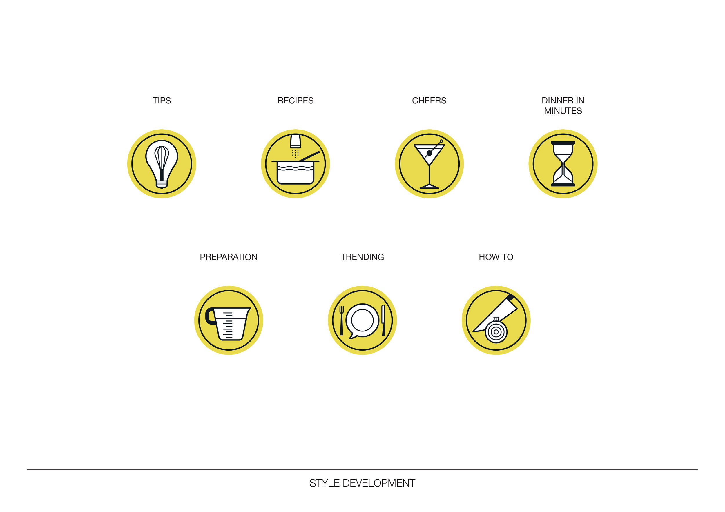
Iconography: I commissioned Studio Muti to illustrate an icon set for the new site and newsletter. Using the pronounced lines of the logo and yellow from the color palette, the icons created fit seamlessly into the site. They are also used across our 5 newsletter products: Eat Voraciously, Plant Powered, Baking Basics, Meal Plan of Action and Zero to Dinner Party.
Marketing: I created all of the visual assets for brand launch and continue to design outward facing collateral including Instagram campaigns, facebook advertisements, washingtonpost.com homepage takeovers, subscriber e-mail initiatives, brand partnerships, and merchandise (like the apron above).
